
How to navigate the Pivot Summary
Click on Analytics in the Function Menu to view summary reports of the uploaded BAPLIE data. Select Pivot Summary to display a pivot table of the data. It is possible to customize the table to your preference, save reports for use with future files, and share the reports with your facility.
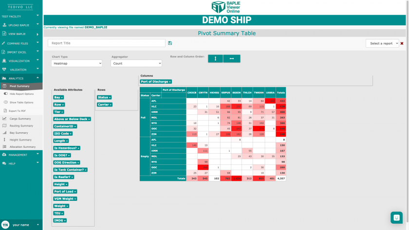
Add any data attributes to the pivot table’s rows or columns by dragging the attributes to the appropriate section. Drag an attribute out of the row or column section to remove it from the pivot table view.
Navigating the Pivot Summary option
Similar to using the pivot table function in Excel, BAPLIE Viewer Online has many options for choosing how to view reports and which data points are being compared.
Under the Pivot Summary option in the Function Menu, there are three buttons: Report Options, Table Options, and Export to PDF. 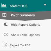 If you click Report Options or Table Options, the menu will either expand or collapse the option from your view. Use this to make changes to the report and table.
Report Options
When you first load the Pivot Summary, it will default to showing the report options. From these selections, you can either search for a saved report or save the current pivot table as a new report. If you are the administrator of your facility, you will also be able to share reports and delete shared reports.
To save a pivot table for future reporting with other BAPLIE files, simply enter a report title in the space provided. Click Save Report. A pop up will appear and confirm once the report has been saved, and you will be able to view, share the report with your facility, or delete the saved report using the dropdown list on the right side of the screen.
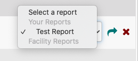
To load a report, simply select the report from the list and it will automatically load.
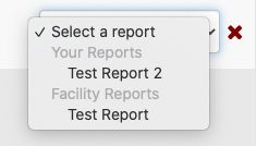
To delete a report, first select a report to load and then click the red X to delete it. A pop up will appear to confirm that you wish to delete the report, and then it will be removed from the dropdown list.
Table Options - Change Pivot Table Type
When you first load the Pivot Summary, it will default to the table options being hidden. Click "Show Table Options" on the left side of the screen in the Function Menu. Once the table options are shown, you will be able to customize your view of the pivot table. Different options will allow you to change the type of chart shown, the method of aggregating your data, as well as the row and column order of the pivot table.
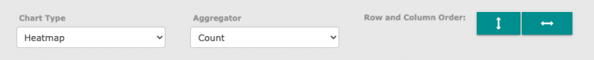
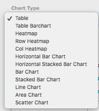
Chart Type
The Chart Type dropdown menu has options for the pivot table view. For example, Table will show a basic view with the totals listed, while Heatmap adds shades of color to the table based on total counts of the attributes selected. Choose which chart type you prefer, and the pivot table will automatically update on your screen.
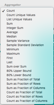
Aggregator
The Aggregator dropdown menu allows you to specify the method of calculation that should appear in the totals section of the pivot table. Choose any aggregator you wish to view, and the pivot table will automatically update on your screen.
Row and Column Order
The row and column order buttons allow you to sort the pivot table to your preferences. Click either button and the pivot table will automatically update on your screen.
Double edged arrows indicate that the list will be sorted in alphabetical order for the rows and/or columns.

Arrows pointing down (for row) or to the right (for column) indicate that the list will be sorted in ascending order - from smallest to largest.

Arrows pointing up (for row) or to the left (for column) indicate that the list will be sorted in descending order - from largest to smallest.

Export to PDF
Click the Export to PDF button to download or print the pivot table. The export will automatically begin to download.
Viewing the containers from the count results
At any point, you can quickly view the containers that are represented in your pivot table. Click on any value in the pivot table to see a list of Container IDs. You can easily copy the Container IDs by highlighting them and using your Command + C keys.